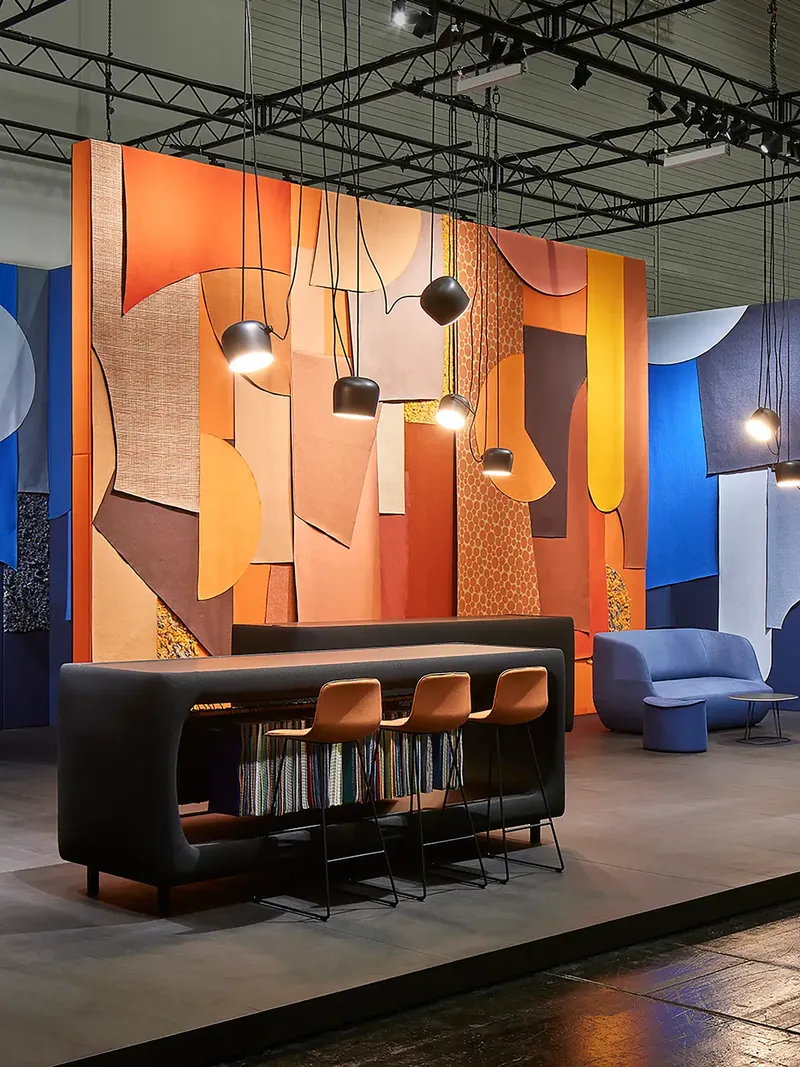

Here are our favourites and the reasons why these stands stood out so positively:
Tarkett: The Beauty of Circularity
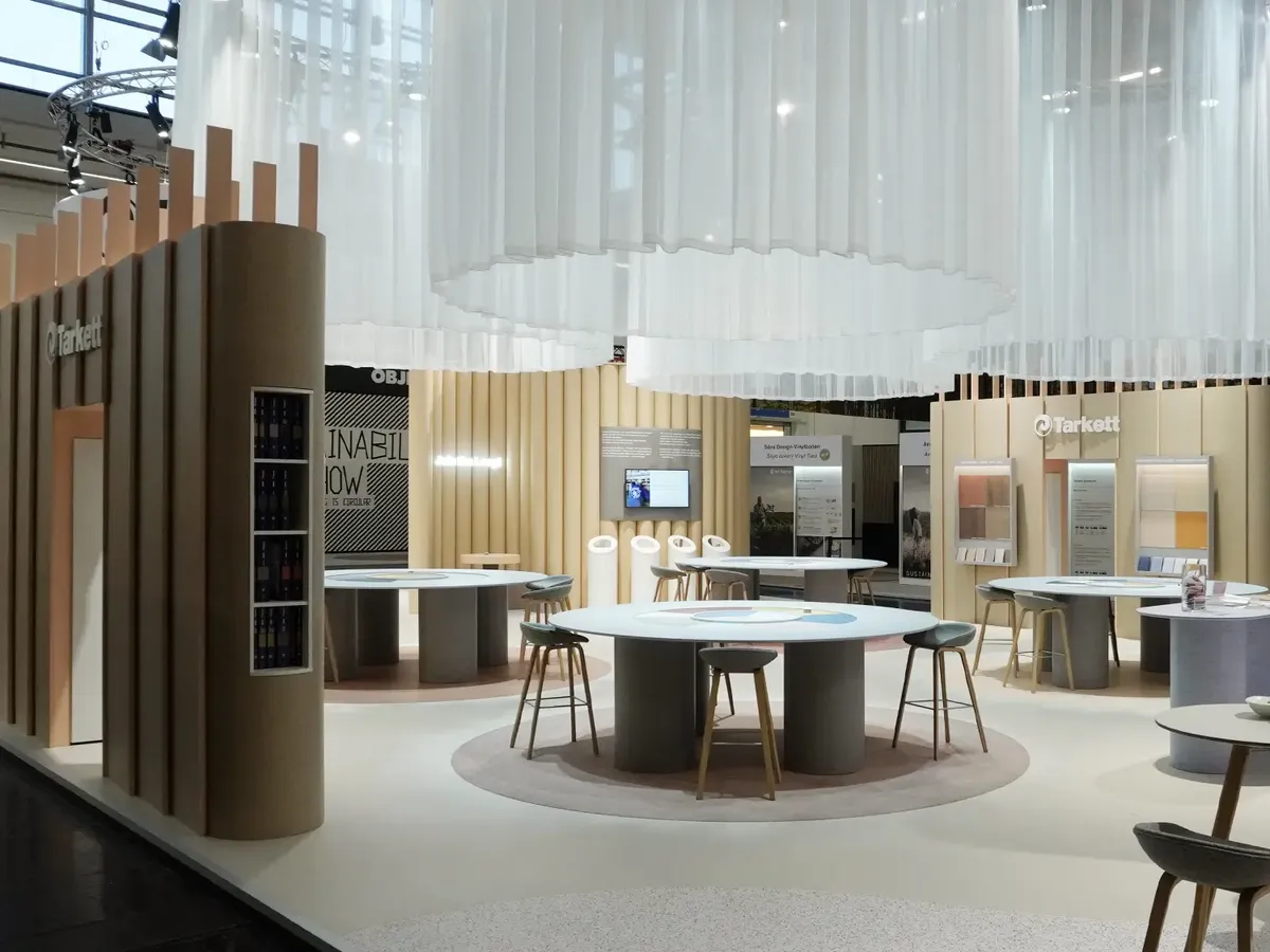
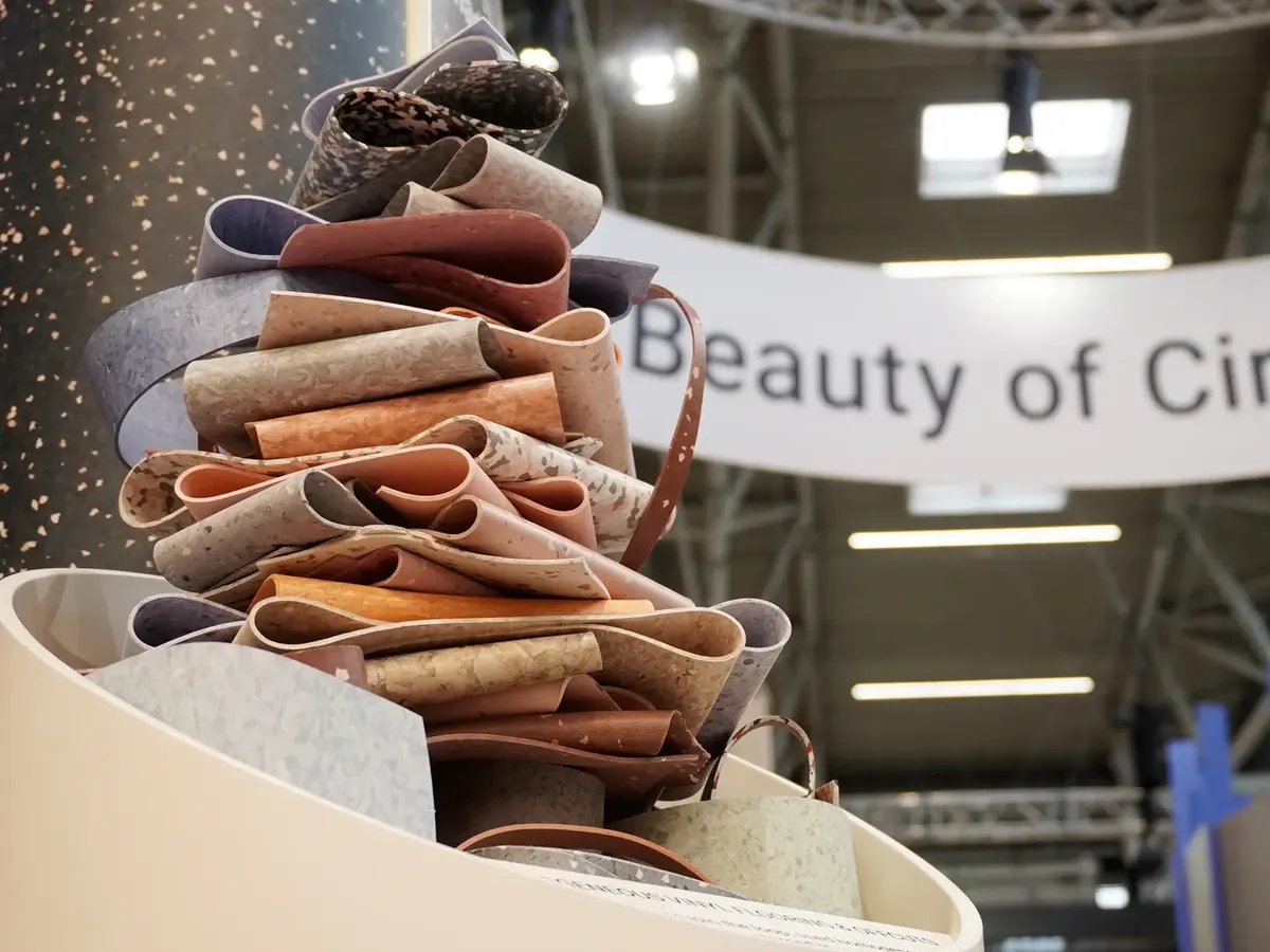
The stand’s motto was carried through consistently here. Rolled linoleum floors standing in a quiver like sketch paper and folded vinyl flooring offcuts, skewered and reminiscent of an art object, set clear, aesthetic accents. Across 400 square metres, Tarkett put its circular flooring collections centre stage. Another highlight: the company’s own take-back and recycling programme ReStart®, which according to Tarkett is intended to reduce CO₂ emissions and disposal costs.
But regardless of the product-specific content, the stand also impressed with its architecture. A pastel, inviting world of colours and materials was a treat for the senses and was particularly inviting to touch and browse.
Agrob Buchtal: Road to Net Zero
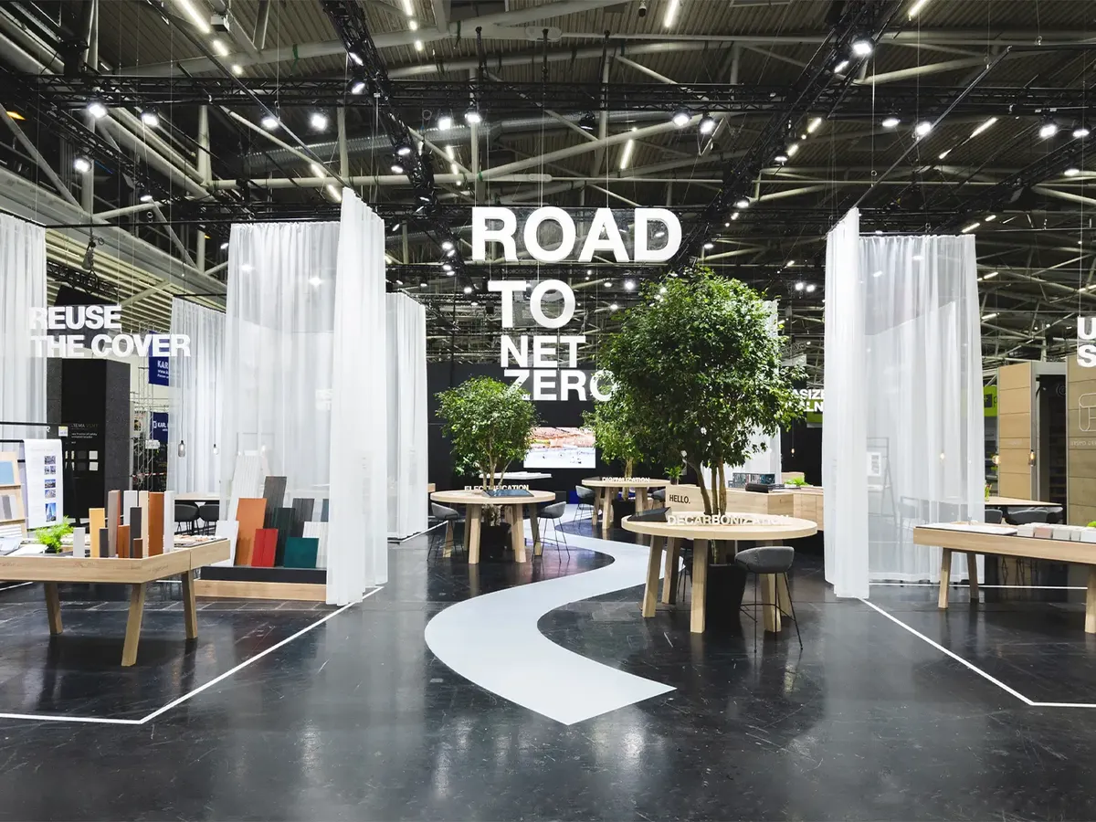
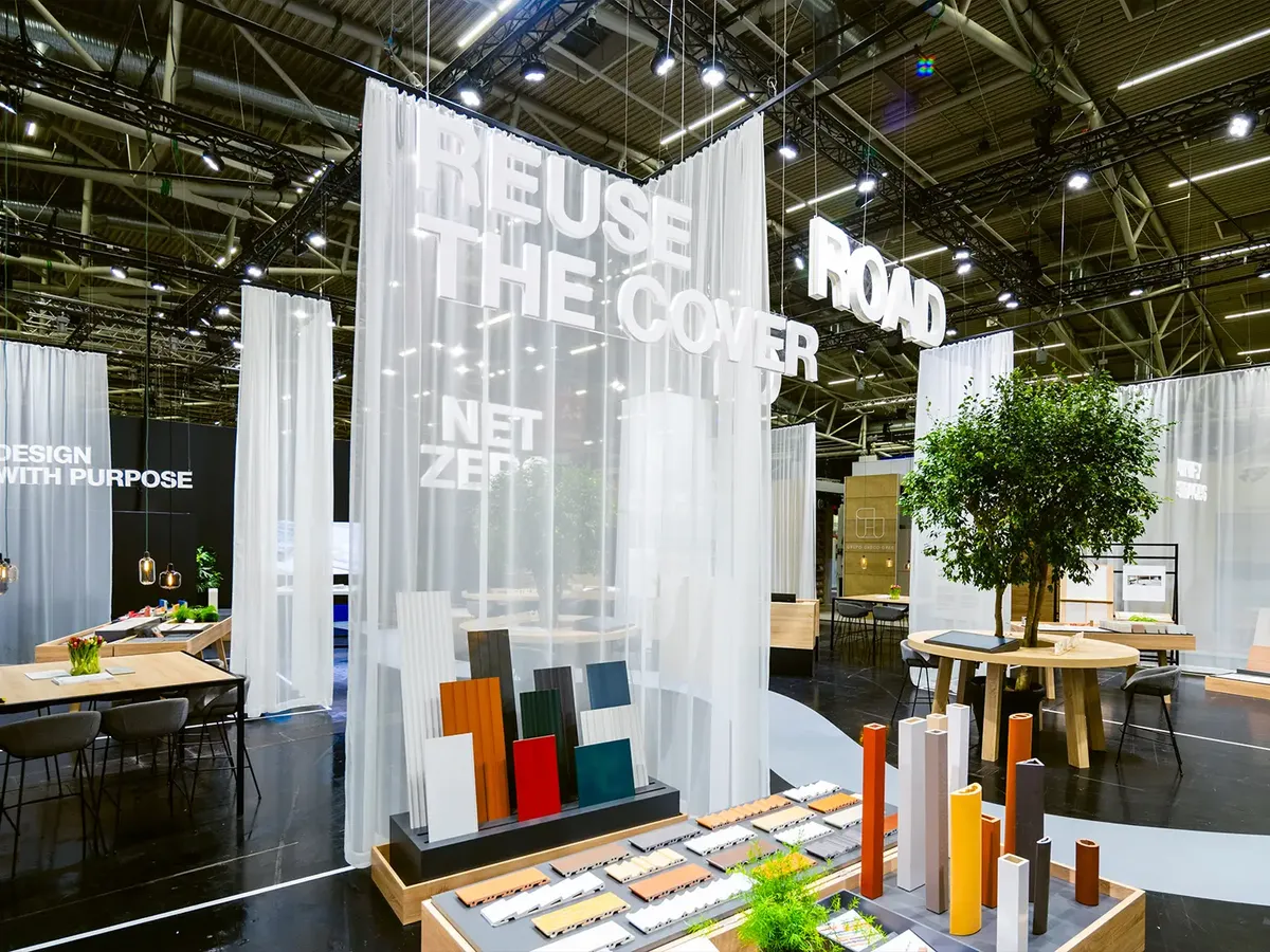
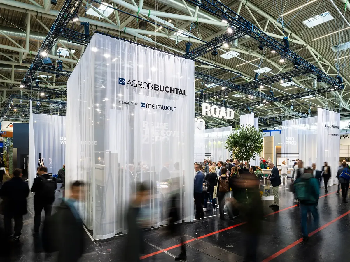
Agrob Buchtal opted for a simple but effective approach: the curving path lines with the claim »Road to Net Zero« ran through the stand like a green thread (in the symbolic sense), with various stopping points along the way. The tiles and products at the sample tables could be tested extensively and taken away. Giveaways such as sketchbooks and samples left a lasting impression, as did the hospitality with coffee, drinks and snacks.
The special twist? Agrob Buchtal did without its own floor covering and used the existing exhibition hall floor. The threshold-free connection to the hall made the stand open, and all stand materials will be reused afterwards.
A little treat: we got to admire the stand before BAU, because we had been commissioned with the accompanying communication on LinkedIn, Instagram and by email. Our approach: »communicate sustainability without mentioning sustainability«.
Formani: a gallery of fittings
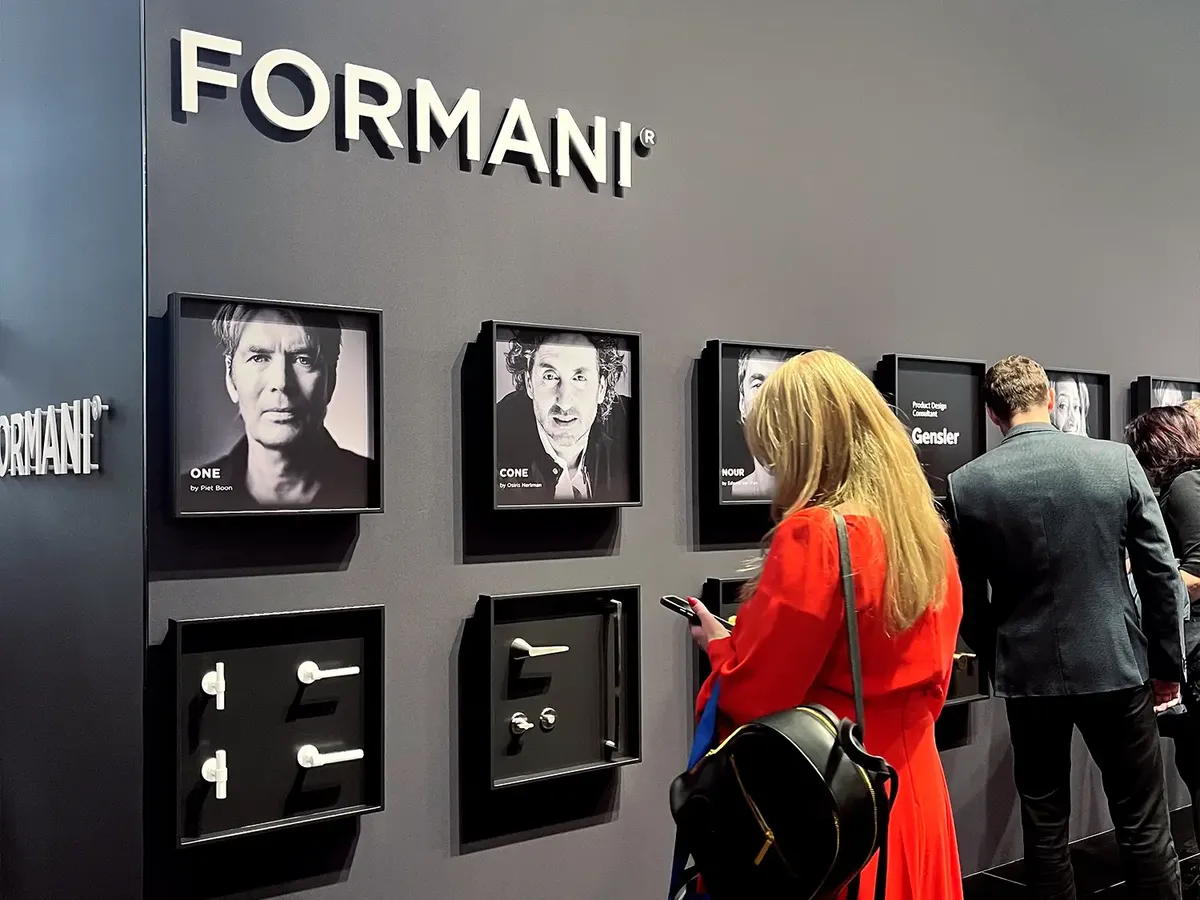
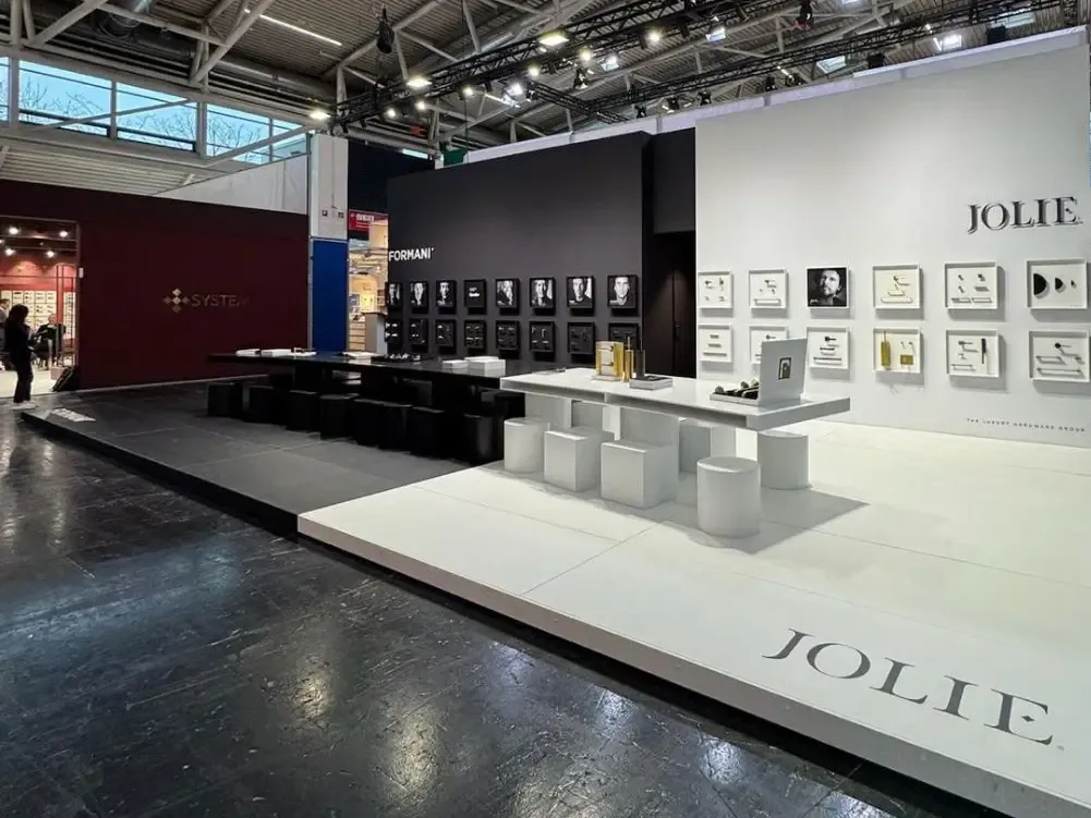
Am I at a trade fair or in a gallery? That was the thought prompted by the stand of Formani and its sister company Jolie Handles, both part of the Luxury Hardware Group and standing for premium fittings, craftsmanship, design and functionality. The clear division into two (Formani on the left in black, Jolie on the right in white) ran through every detail: from the picture frames and seating to the tables and decoration. The respective designers were elegantly showcased above their fittings and handles, like artworks in a gallery.
The communicative heart of the stand? A long table, also divided in two, that invited people to work, rest, talk and snack. This central spot was well used and gave the stand a lively atmosphere: a calming space in the otherwise rather hectic surroundings of BAU.
Object Carpet: substance over show
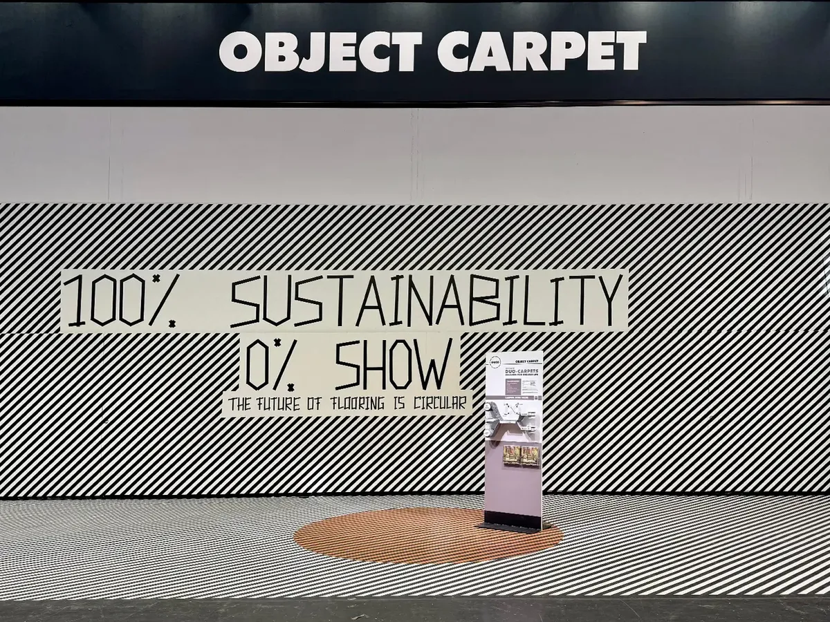
A stand like this takes a good deal of courage. The expensive square metres of exhibition space are booked, the highlight of the year, BAU, is approaching, and Object Carpet? Went for reduction. At first glance, the space looked empty. But behind the stand, taped off with black adhesive tape, lay an invitation to the Munich showroom. In parallel with the trade fair, staff there offered personal conversations and detailed insights into the products.
Our verdict: bold, clear and unlike anything we’d seen before. An approach that belongs in our top 11 and at the same time sends an important signal: for creative solutions and against the mountains of waste at every leading trade fair like BAU.
Häfele: built study »Dynamic Living«
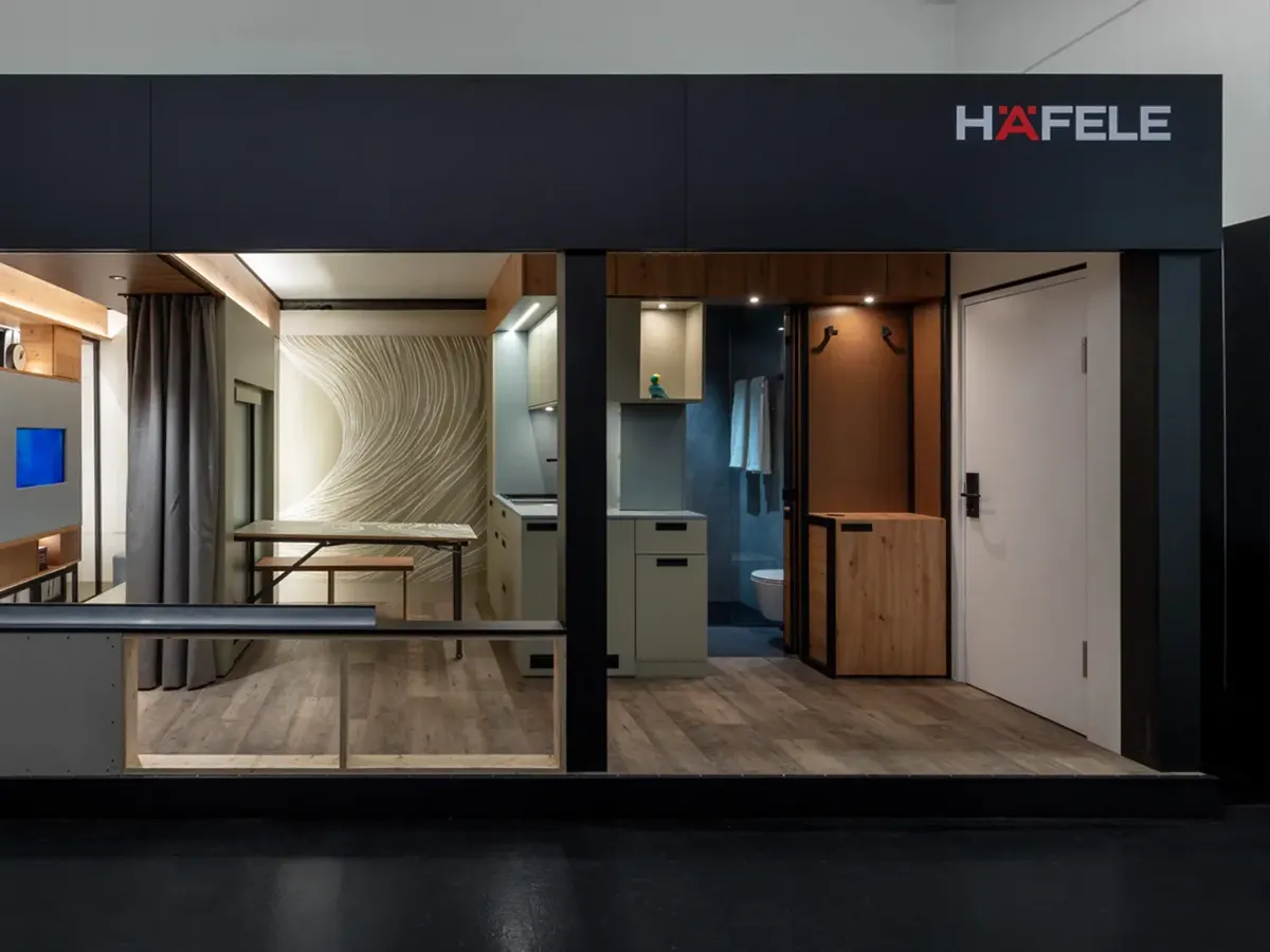
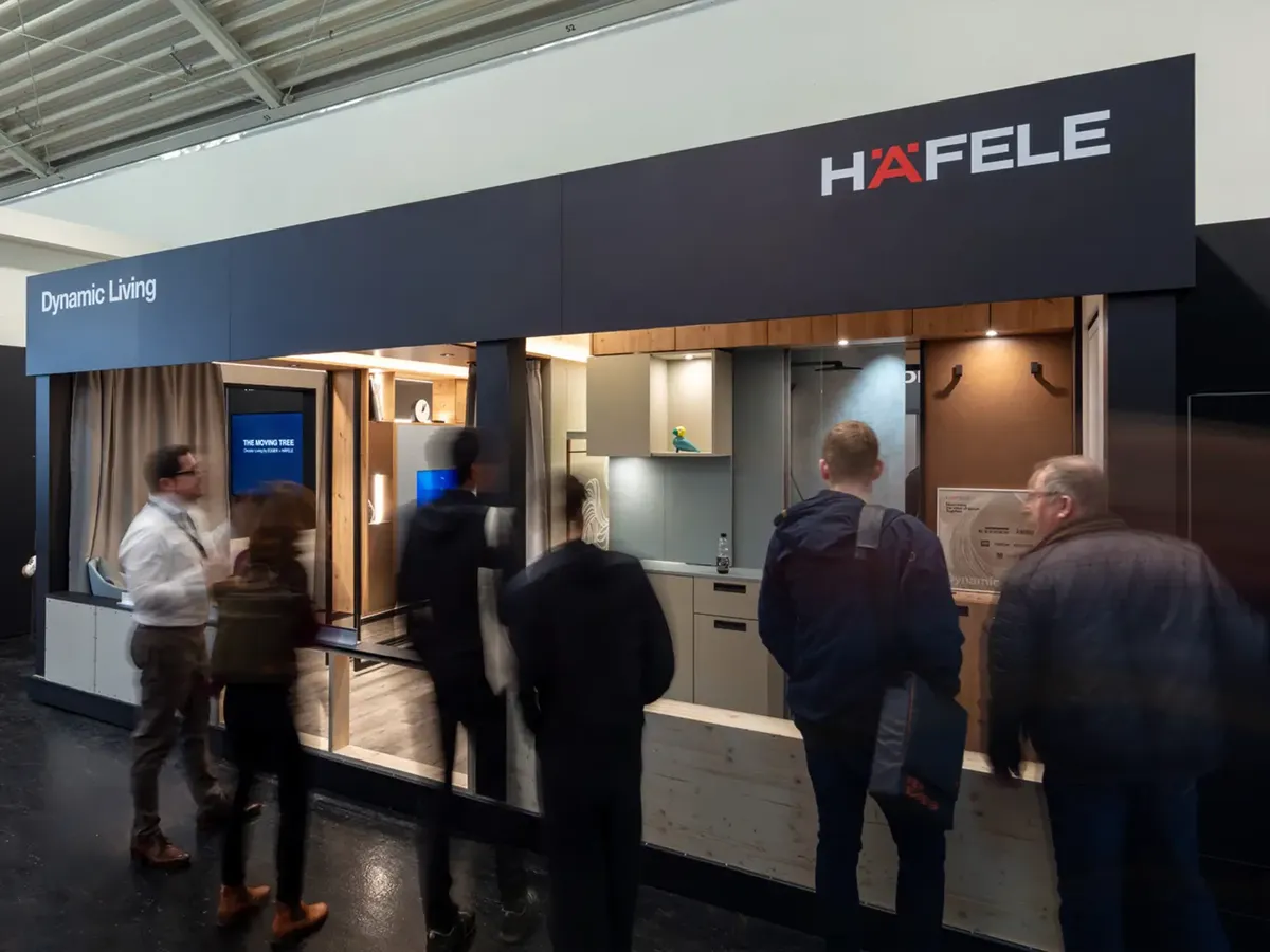
When one stand isn’t enough, Häfele simply books a second one. And it paid off. Under the name »Dynamic Living«, the perimeter stand presented the product portfolio as a built case. The question: how can we live in just 18 square metres? Live demonstrations of the convertible tiny living solution drew visitors’ attention. Anyone strolling past by chance stopped and was won over by the dynamism of the concept.
And anyone who wanted to know more could visit the main stand. One thing is certain: demonstrating the functionality of your own products this practically in a real installation situation is hard to beat.
WIEHAG: reduction with structure
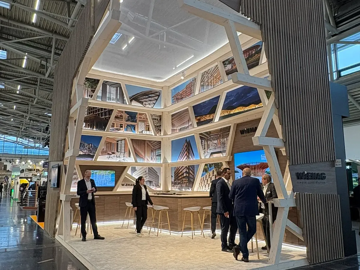
An approach we often recommend in strategy projects for building product manufacturers: let reference projects speak for themselves. And that’s exactly what WIEHAG did. Built from its own materials, the stand impressed with simplicity and clean lines and showed nothing but reference projects. The load-bearing timber structure framed large-format projects and put a clear focus on what matters: communicating through completed buildings.
What we particularly liked: the stand opened up to the trade fair audience like a torn-open corner. This not only made the timber beam structure visible from the aisles but also emphasised the inside of the stand like a glowing treasure chest.
Stora Enso: showing big things in miniature
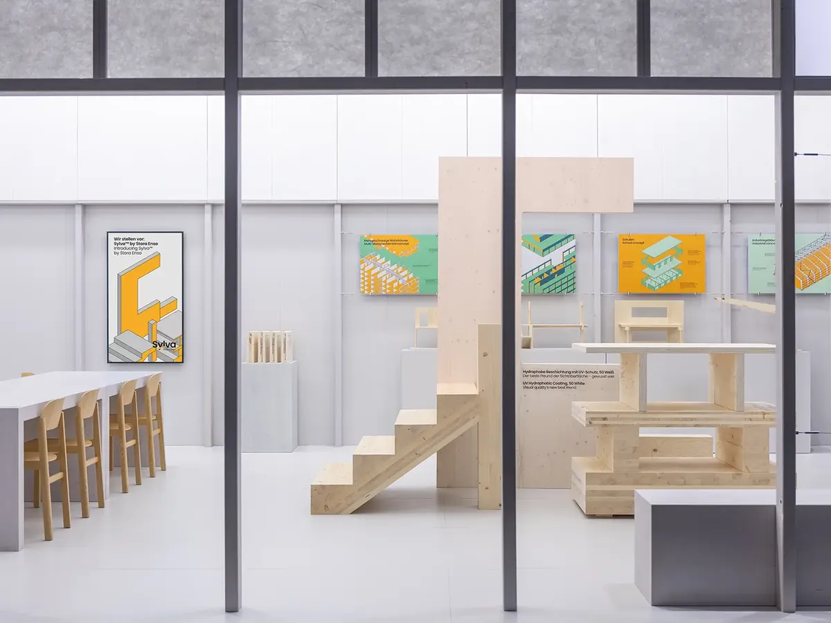
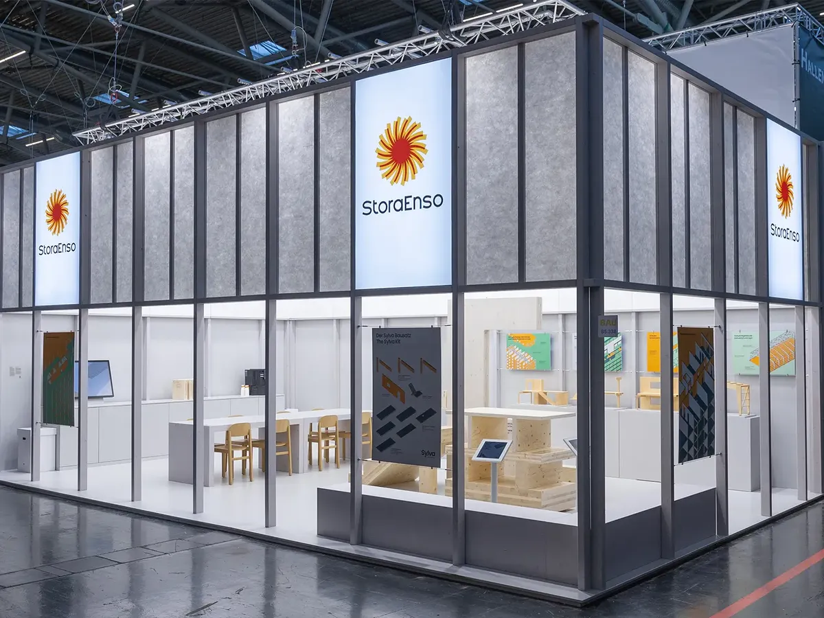
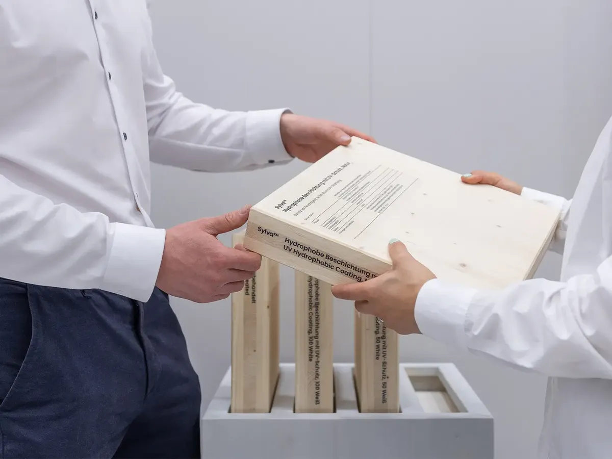
Stora Enso went for a stand that combined architecture and material. Its own products and systems were integrated directly into the stand architecture, which was convincing both outside and inside. Fine details, such as presenting the system through small architectural models, particularly attracted architects. The accompanying documents and flyers also impressed with their high (information) quality.
Particularly worth mentioning? The stand was reused from BAU 2023, with new exhibits but identical architecture. This didn’t come across as boring or monotonous at all. Instead, it emphasised recognisability and showed that a stand can be reused well.
Lindner: a statement in red
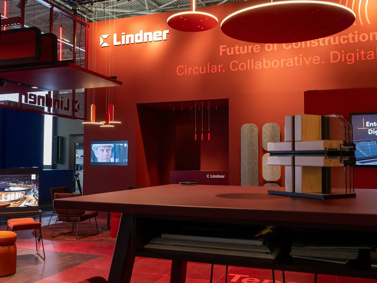
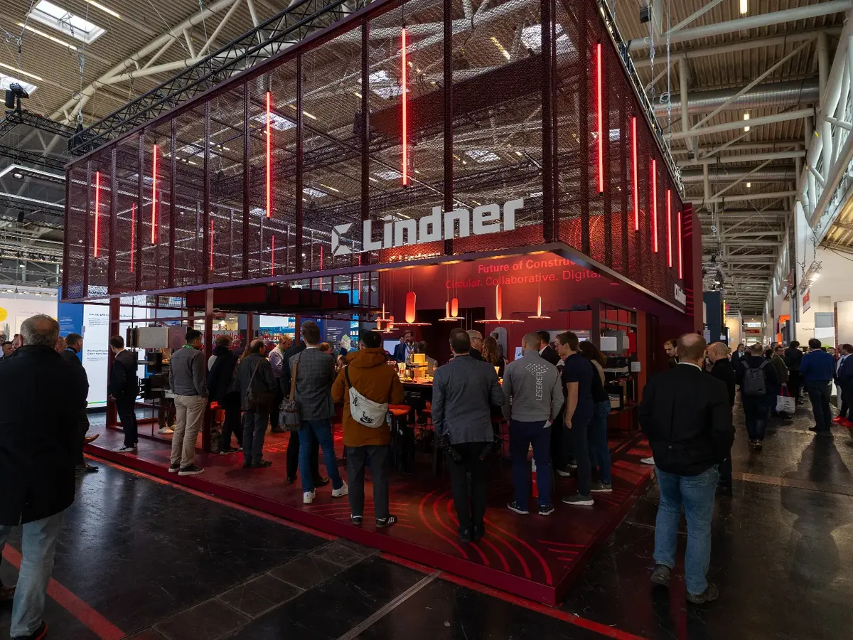
With a clear focus on the »Future of Construction«, the Lindner Group showed a stand that put the themes Circular. Collaborative. Digital. in the spotlight. Kept in bold red, the stand developed a radiance through illuminated LED strips in the upper section of the expanded metal that was visible from a distance. The consistent colour scheme (from the expanded metal to the furniture, lights and floor covering) gave the stand a coherent aesthetic.
By the way, this was not the first time the stand’s basic structure had been used: it was originally created together with the Danish textile flooring manufacturer Ege Carpets for ORGATEC 2024. At BAU 2025, however, the focus was on circular products for floors, walls and ceilings and on circular business models. And anyone who wanted to talk about career development and a new direction had also come to the right place at Lindner.
Orama: seemingly weightless
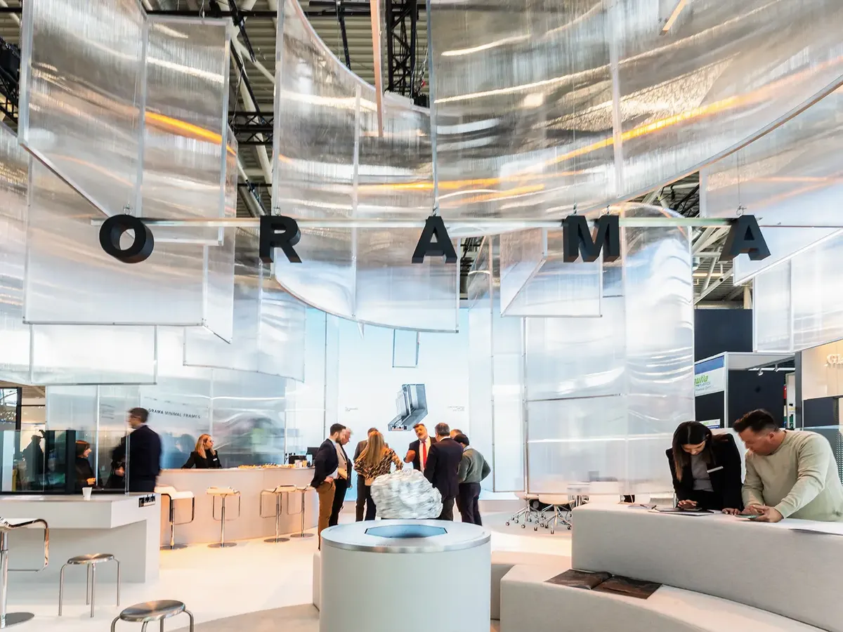
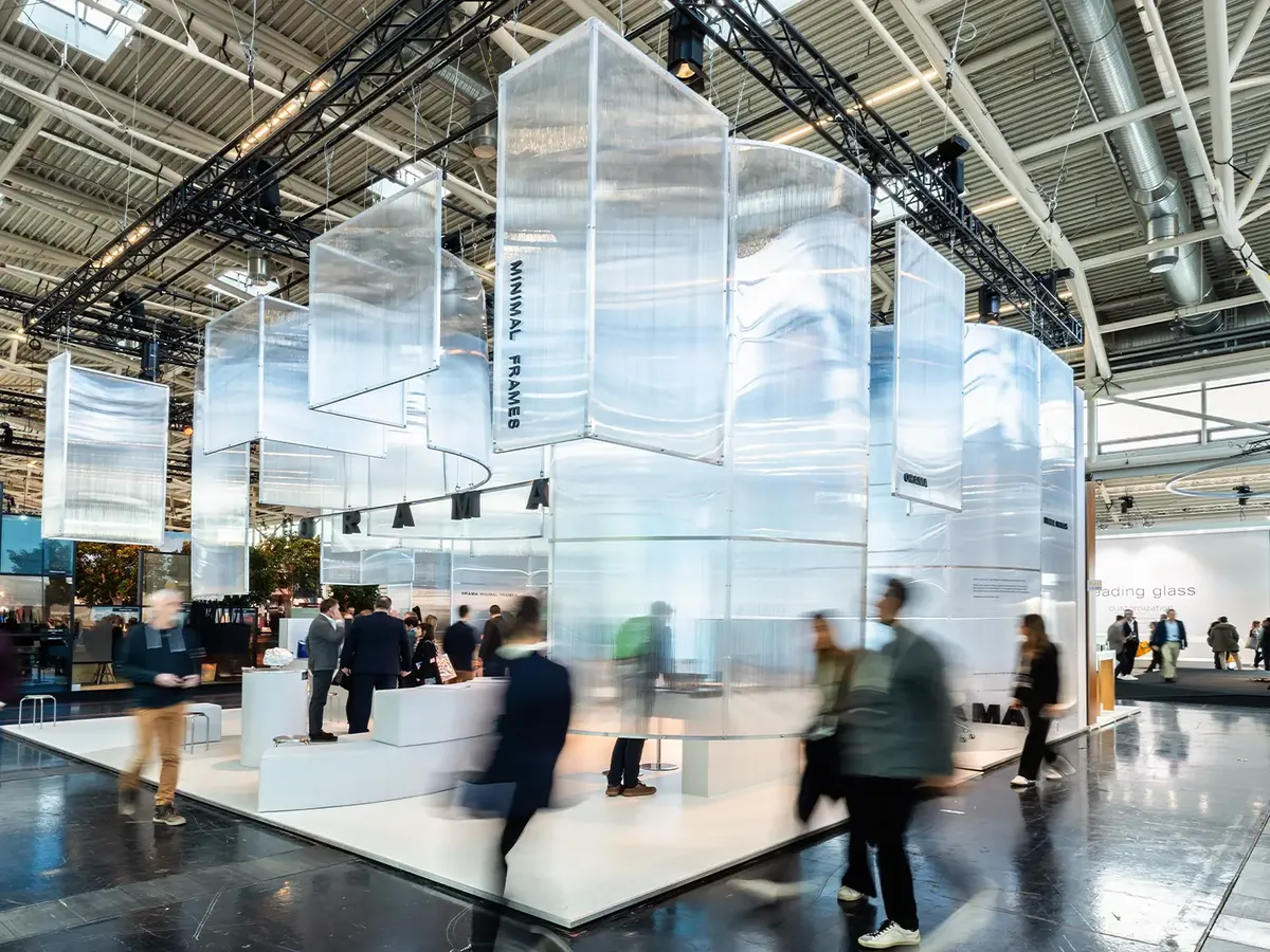
Designed by the Role Play Agency, the stand of Orama Minimal Frames was a visual highlight at BAU. With a structure of translucent panels and floating elements, Orama showed how products can be presented as if weightless, while at the same time reflecting the minimalist aesthetic of the frameless window and door systems. The open, inviting layout created a flowing transition between the individual areas and literally drew visitors into the stand through subtly lit surfaces.
The design was a tribute to reduction, with one special highlight: black jute bags as giveaways, cleverly integrated into the stand architecture. They seemed like a living part of the design, which changed constantly as visitors interacted with it.
Westag: a door opener for architects
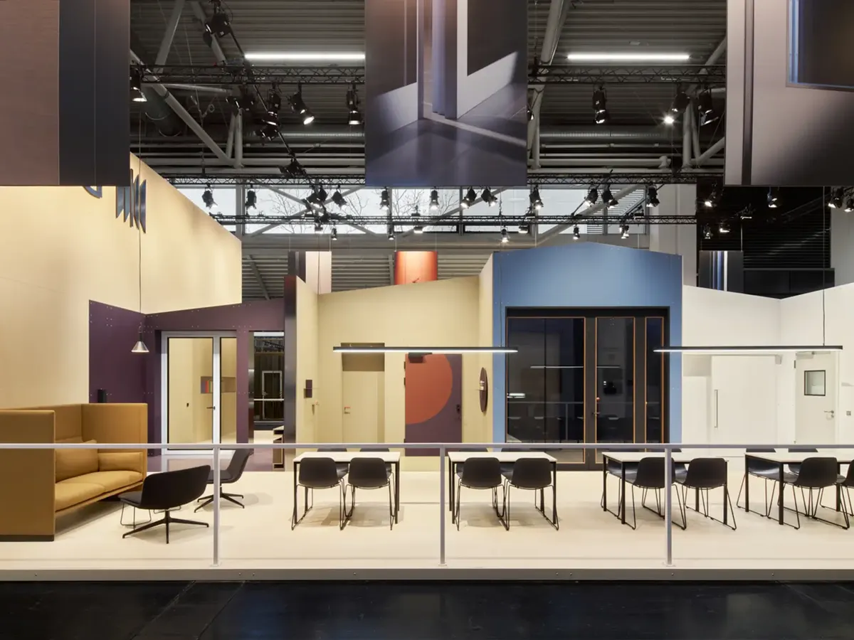
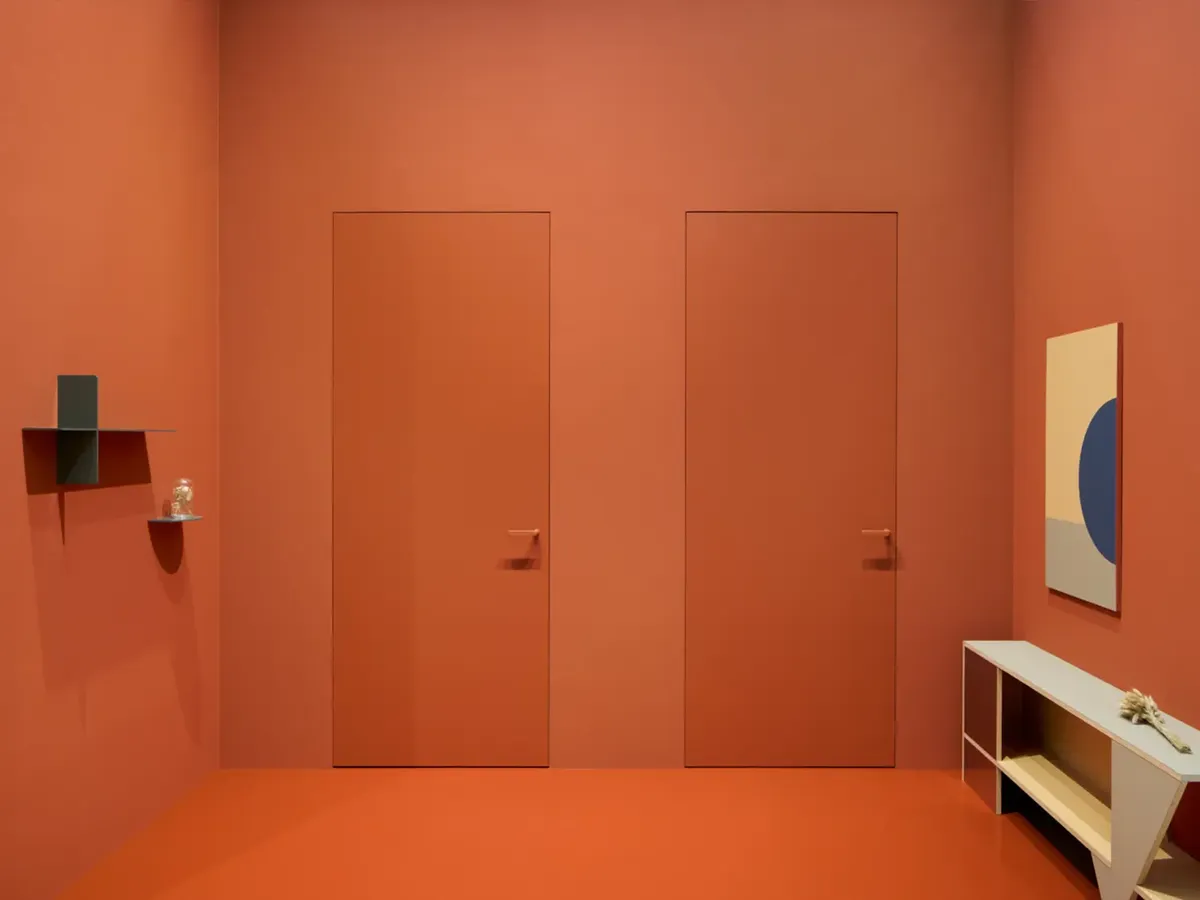
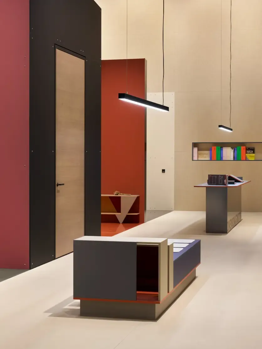
Just a few weeks ago, Westag made it into our trade fair guide as a best case with its stand at BAU 2023. Now comes the next entry on our »very well done« list: this year, too, the stand impresses with its inviting architecture. Space-defining elements showed off the doors perfectly, and communicative in-between zones created plenty of room for dialogue.
By the way: the entire stand will continue to be used as a permanent exhibition in the showroom at the headquarters in Rheda-Wiedenbrück. Materials, products and exhibits will thus go on being used in another place.
mods: understated refinement
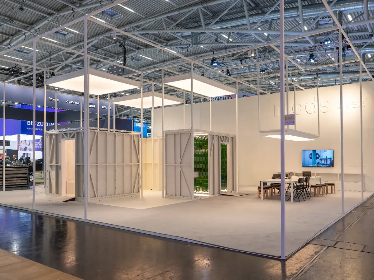
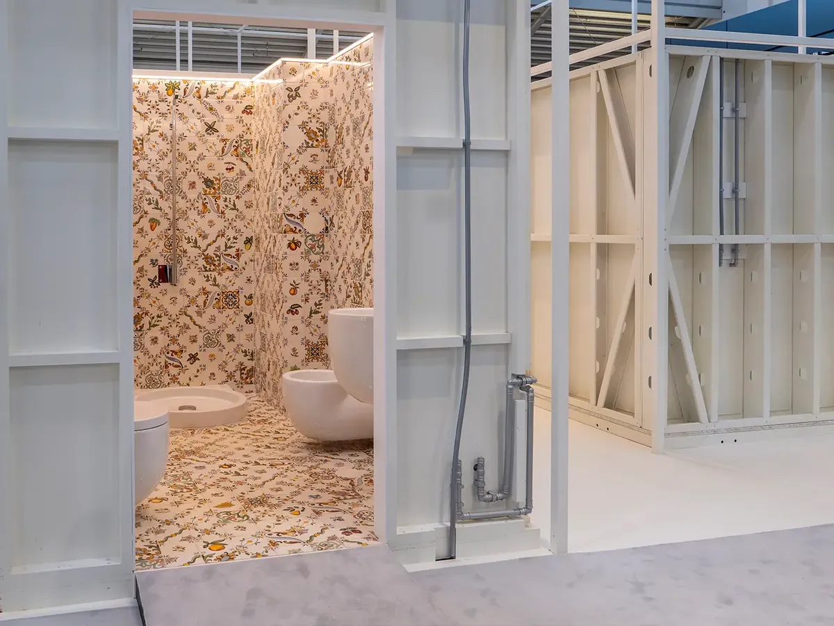
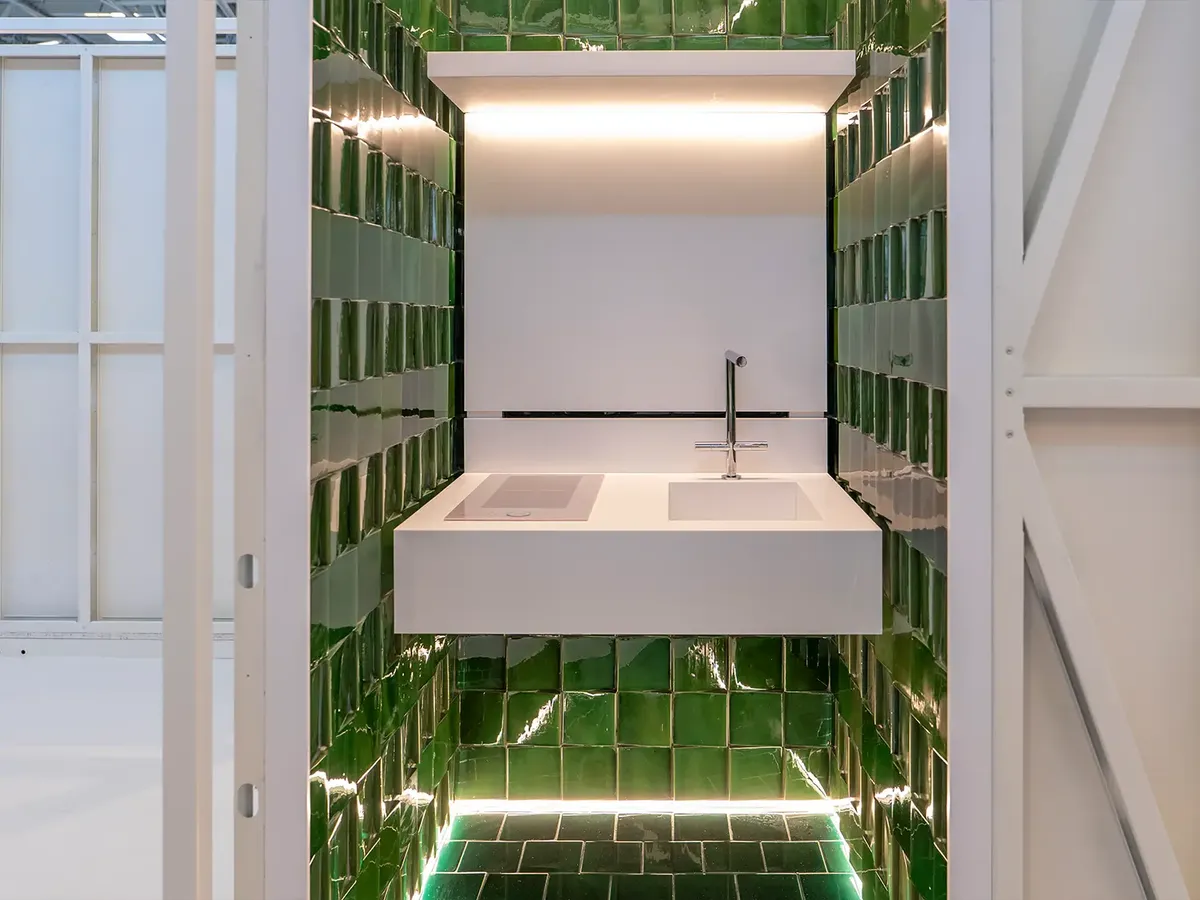
The stand of mods won us over at BAU with a minimalist stand design that revealed its full refinement at second glance. The cream-white outer shell of the modular bathroom pods contrasted with artfully crafted Portuguese tiles inside.
Every detail reflected the high quality of the design: selected sanitaryware, custom-made furnishings and elegant, laboratory-like light boxes. The delicate metal structure symbolised the building structure and made the modular system immediately understandable. As a brand positioned in the high-end architecture segment, mods conveyed an attitude that appealed to architects in particular: subtle but convincing.
From top 11 to top 14: three special mentions
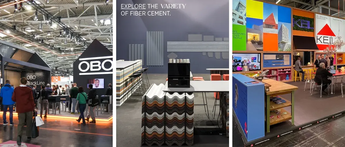
Alongside our top 11, we’d like to highlight three more stands that were left off the list for good reason: OBO Bettermann and Etex, whose stand designs we developed ourselves and which are therefore not part of the ranking, and the company Keil, which focused primarily on a different target group. All three offer approaches that show what makes a successful stand: plenty to touch, little frippery and enough room for exchange.
Clarity through material and space at Etex and OBO
- Both stand designs focus on what matters: the product. The Etex stand consisted mainly of stacked materials from its subsidiaries Equitone, Eternit and Cedral, from which tables and exhibits were made. Open, low elements created an oasis in the crowded exhibition hall.
- OBO Bettermann, by contrast, relied on a clear structure: the two »houses within the house« literally offer a roof over your head and showcased the new OBO Blackline.
Success factor: trade fair staff
- Both companies have one thing in common: however good the trade fair is, without the right stand staff even the best stand loses its impact. Training the teams is therefore the be-all and end-all. For OBO Bettermann, we even ran a last-minute training session shortly before BAU opened to prepare the sales staff for the target group.
Craft meets design
- Last but not least: the Keil stand impressed with a clear focus on installers. Workbenches and well-thought-out details, perfectly matched to the target group, were brought together in an aesthetically appealing design. The brand presentation stood out particularly positively: relaxed, clear, professional and at the same time with a tangible enjoyment of craftsmanship and well-thought-out detail solutions.
Conclusion: a focus on addressing the target group
A clear focus on addressing the target group well was a defining theme of BAU 2025. Equally encouraging: sustainability was integrated more as a natural part of things instead of seeming staged. Superficial »green claims« or greenwashing faded into the background, while credibility and transparency dominated.
Even if not every stand was equally convincing, many exhibitors showed a shift in their communication: away from standard solutions, towards more relevance for the world of design and planning. For us, one thing is certain: BAU remains a place worth visiting. And we’re curious to see how the trade fair scene develops by 2027.