How to present samples: How to impress (interior) architects and what you should avoid.
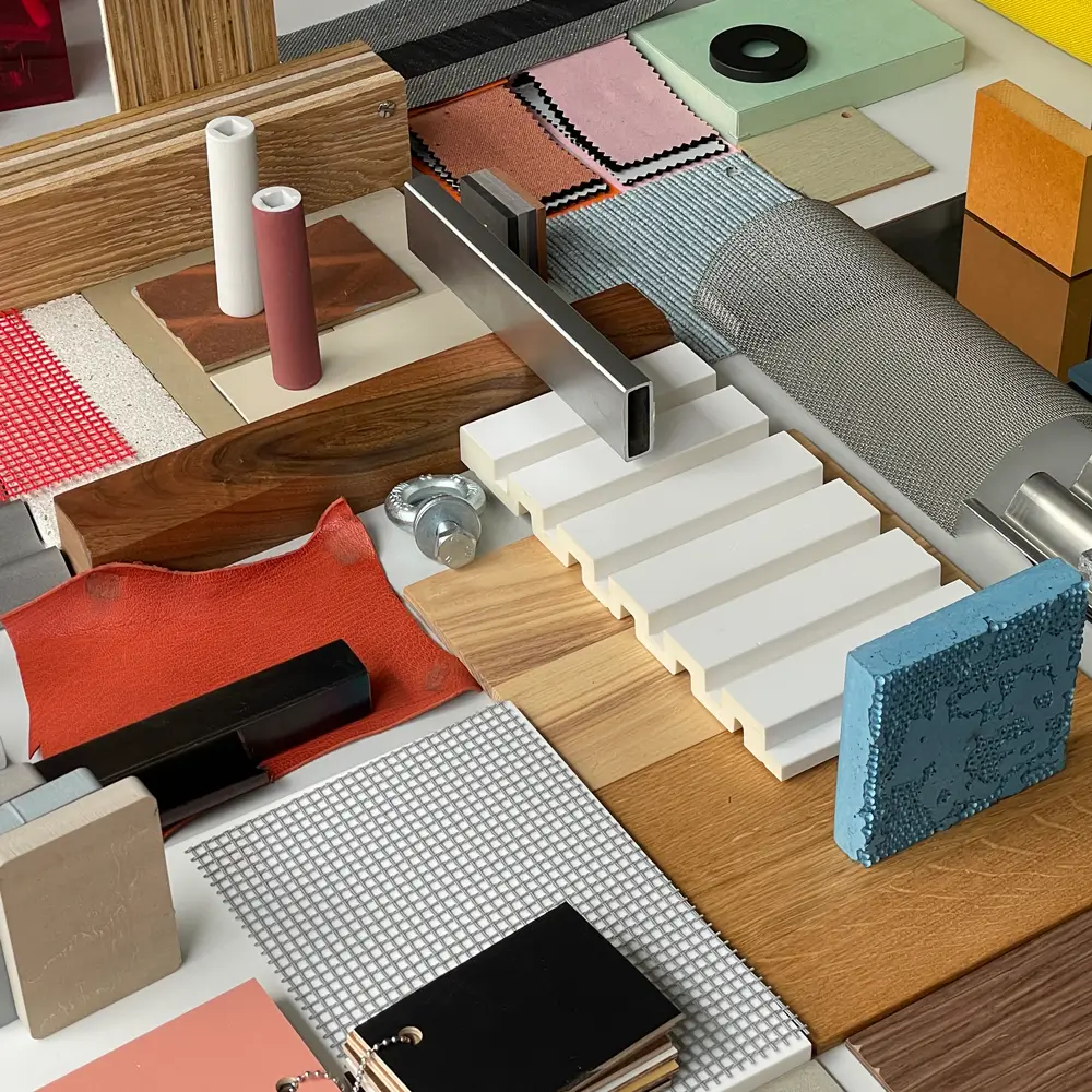
Samples play a central role in the planning process. They not only serve as a source of inspiration but are also crucial for evaluating materials, surfaces, and colors. And let’s be honest: doesn’t a good sample sometimes say more than a thousand catalog pages? Samples offer building product manufacturers an ideal opportunity to catch the attention of architects directly. But how can you ensure that your samples are not only well-received in the planning office but also used effectively? We will show you what matters and which mistakes you should avoid.
Why samples are indispensable for planners
Before we dive into the tips and tricks for effective sample presentations, let’s take a look at why samples are so important for (interior) architects – and, by extension, for builders:
Samples…
…inspire
They help turn vague visions into concrete concepts, allowing an initial idea to be quickly transformed into a tangible design.
…don’t lie
Only by physically touching can it be truly assessed whether a material meets functional and aesthetic requirements—whether in terms of texture, scratch resistance, durability, or color accuracy.
…accelerate decisions
In discussions with the client, samples are an essential communication tool to illustrate surfaces and make the final selection.
»One thing you should keep in mind: As soon as the sample reaches an (interior) architect’s hand, their attention is diverted, even if only for a brief moment. It will be touched and examined from all angles—both a blessing and a curse. So, carefully consider when to present the sample, and share your most important information either before or after.« — Franziska Holzmann, Strategic Consultant at hej.build
The journey of the sample: How to stand out at every stage
From the request to its arrival in the office—and, ideally, back to the manufacturer—the sample goes through several stages. At each of these points, there is a chance to differentiate yourself from the competition, whether through the sample itself or the accompanying service. But when and how can you influence the process?
1. Sample request and ordering – Good user experience from the start
How easy do you make it for planners to order products and samples? A process that is intuitive and straightforward is ideal. Order forms on your website or designated company contacts who can be easily reached are optimal. Avoid complex request forms or missing contact information on your website. Charging for samples? A clear deterrent.
2. Packaging and presentation – First impressions count
Deliver your samples in well-designed, practical packaging. Provide sample folders, boxes, or bags that are easy to handle and aesthetically pleasing. Removable samples that can be individually compiled for various sampling situations are a big plus. Avoid unnecessarily large packaging with small samples inside—it appears impractical and unsustainable.
3. Labeling and product information – No room for confusion
A sample that passes through many hands must always be identifiable. Manufacturer names, product details, and QR codes linking directly to the specific product page—not the homepage—are essential. Missing labels? This often leads to samples being misplaced, either on desks or in project bins.
4. Logistics and delivery – No room for delays
Time is one of the scarcest resources in planning offices. Ensure fast and reliable delivery. A damaged or delayed sample can disrupt the entire planning process—and in that case, planners may turn to a quicker competitor. Consider offering to take back large or no-longer-needed samples, as space in offices is often limited. A quick and hassle-free return service is a big advantage.
5. Arrival in the planning office – Spotlight or dust collector?
Your sample needs to stand out. Most planning offices have limited space, and many materials are waiting to be organized. The format is key: to be well-received, your sample should be compact, easy to store, and well-organized. Flexible formats or binders that can be customized are especially popular. Additionally, offer your samples in different formats or with overview cards.
<div class="highlight"><span class="roof">Contact us</span><br/>Would you like to check if your sample presentation is targeted and up-to-date? Let’s take a look at it together. Feel free to contact us via our contact form.</div>
Muster, oh Muster: Challenges for planners and manufacturers
Samples are essential for planning offices. However, planners often face the challenge of managing growing sample collections and avoiding unnecessary clutter. Different formats, space problems, and the time required for maintenance consume valuable resources. For planners, compact, up-to-date, clearly labeled, and easily accessible samples are a must. The clear request to manufacturers? Make it as easy and straightforward as possible.
Manufacturers, on the other hand, often struggle to develop a sample presentation that is not only visually appealing and meets the aesthetic expectations of planners but is also practical and cost-efficient. Both production and packaging hide costs, which is why the quality of product samples, as well as attractive and minimalistic packaging, sometimes fall short. Success also heavily depends on reliable, sustainable delivery and well-planned logistics.
But here’s a small tip: The effort is worth it. Whoever shows interest in your samples is usually also interested in your company. And that makes them a much hotter lead than casual trade show visitors.
»We want to be kept up to date on what’s happening in terms of innovation with manufacturers.« — Anni Rosenberg, brandherm+krumrey interior architecture

As part of our industry update on sample presentations, we asked Anni Rosenberg, interior architect and associate at brandherm + krumrey interior architecture, how her office handles samples and what helps them the most:
- Short, concise update meetings of no more than 30 minutes, where new products and collections are presented clearly and without fuss.
- Avoid thick product catalogs, as while they may contain beautiful product images, hand samples are used more often in day-to-day work.
- Take back large and bulky samples, as material libraries are bursting at the seams, and samples are often only needed for the duration of the project.
- Direct contacts for ordering hand samples, as it’s easier and quicker than using online portals with login barriers.
- Reliable and timely delivery, as otherwise materials from other manufacturers will be requested.
- Free material samples, as charging for them can lead to planners choosing another manufacturer’s products.
What does the ideal sample presentation look like from the perspective of (interior) architects?
- It is clearly laid out and not overloaded.
- The packaging is tactile, visually appealing, and sustainably produced.
- It offers flexibility with removable samples, so they can be placed next to other samples on the table or individually compiled for sampling appointments.
- It includes overview cards in a small format for different colors and finishes, with the option to order larger hand samples as needed.
- It is labeled on the back with the manufacturer’s name, product, and color, so materials can be clearly assigned.
- A QR code links to the website, providing up-to-date information.
* in the form of folders, boxes, hand samples, cases, etc.
»A color fan speaks more than a thousand catalog pages.« — Hannes Bäuerle, raumprobe I Material Bank
Der schönste Streichelzoo für Planer:innen

Hannes Bäuerle from Material Bank takes the concept of the optimal sample presentation even further: »Not all samples are created equal: show more of your cards, reveal the components of your products, so they can be experienced with all the senses.« And he knows what he’s talking about. Together with his partner Achim Stumpp, he created the physical space »raumprobe« in Stuttgart, affectionately described as a »petting zoo for planners.«
* Recently, raumprobe has become part of the American company Material Bank, which offers architects a comprehensive platform with its material database and fast overnight delivery service for material samples.
If you’re not yet familiar with the offerings from raumprobe/Material Bank, here’s a warm recommendation to check them out.
But back to Hannes Bäuerle. From the perspective of a self-proclaimed “material freak,” here are eleven concrete advantages of samples that you, as a manufacturer, should be leveraging:
- Physical perception: Products can be directly experienced with all the senses.
- Suitability assessment: Durability and aesthetics can be evaluated for specific applications.
- Decision-making: Physically testing a product reduces uncertainty and increases the likelihood of purchase.
- Transparency: Manufacturers show they are open to a thorough examination of their products.
- Better consultation: Material samples enable more efficient and targeted advice.
- Avoiding misunderstandings: Samples reduce misinterpretations of product characteristics.
- Visual and tactile presentation: A strong marketing tool for use at trade shows, presentations, or in direct sales.
- Differentiation: Stand out from the competition and increase customer appreciation.
- Sales promotion: A tool for sales teams to better present products.
- Proposal support: A crucial advantage in tenders or proposals.
- Long-term customer loyalty: Once a material is experienced physically, it often leads to repeat business and customer loyalty.
How does AI affect architects’ love for samples?
When you ask Hannes Bäuerle whether physical samples will become obsolete, the answer is obvious: a resounding no. On the contrary, samples will become even more relevant as a counterbalance to the digital world. Samples evoke a spontaneous sense of curiosity and, more importantly, trigger emotions in those handling them, emotions that are difficult to replicate digitally. Anni Rosenberg agrees. Digital consultations regarding samples and materials do work but are, in her opinion, much easier to conduct if the sample is sent to the office beforehand and can be physically touched during the explanation.
But even in digital presentations, don’t forget: choose the timing of the sample handover wisely and thoughtfully. For a brief moment, both the heart and mind of the (interior) architect are guaranteed to pause. How often have you seen firsthand that a well-chosen sample immediately sparks enthusiasm? A spontaneous idea can suddenly transform into a tangible design—and that’s the moment when you win over architects.
<div class="highlight"><span class="roof">Contact us</span><br/>Want more information on sample presentations, ready to dive in, or looking for personal connections with experts from (interior) architecture offices? We'd love to have a conversation. Feel free to contact us via our contact form.</div>
Frequently Asked Questions (and Answers) about Optimal Sample Presentation
Is it still worthwhile to regularly drop off samples when maintaining material libraries is so time-consuming?
Yes, regular sample updates are important to stay informed about innovations and new products. Despite the effort involved in maintaining them, samples are essential for inspiration and material decisions.
What do clients care about during sample presentations?
Just like planners, clients usually react emotionally to samples. They want to touch and experience the materials to assess the quality and haptic experience. Price is important, but so is trust in the material and its suitability.
Should manufacturers bring technical advisors to client meetings?
Especially for specific or complex products, it’s helpful to involve technical advisors. They can provide more in-depth information and directly address client questions.
How do you handle bulky products in sample presentations?
Large samples are often impractical for daily use; smaller samples or cutouts usually suffice. For client presentations, larger samples are often used, but these should be collected afterward.
What should be considered when labeling and using QR codes?
Samples must be clearly and permanently labeled, ideally on the back, and include QR codes that link directly to specific product information on the manufacturer’s website. This simplifies work and ensures long-term use of the samples.
Should samples remain free of charge?
Free samples lower the barrier for use. Protection fees may discourage planners from using certain materials. Charging for samples puts you at a disadvantage compared to competitors, and samples are crucial tools for your sales teams.
What’s the experience with digital consultations?
Digital consultations only work well when planners have the samples on hand. Without samples, important details would be lost in remote conversations.
What’s important when manufacturers call you?
Open, honest, and authentic communication is key. Planners appreciate being approached with humanity and genuine interest rather than being subjected to excessive sales pressure.
What are the biggest pain points in dealing with manufacturers?
Time is often the biggest issue. When samples are not delivered on time or promises are not kept, the planning process suffers. Reliability and flexibility from manufacturers are critical.

